Summary
Mission
A complete refresh of design agency’s website to represent their maturity. Convenient, clear, yet jam-packed of new content – this is what me together with the client aimed for.
Outcome
I created a website based on a collaborative visual design & keep the website maintained by adding new content.
I provide the client with statistics and outcomes, so they could maintain their business better & discuss potential changes in the website.
Also, I count a happy client as an outcome as well 💜
Impact
„Klaipėdos dizaino centras“
Visual designer
UX consulting
Adobe Illustrator
Adobe Dreamweaver
Adobe XD
Testimonials
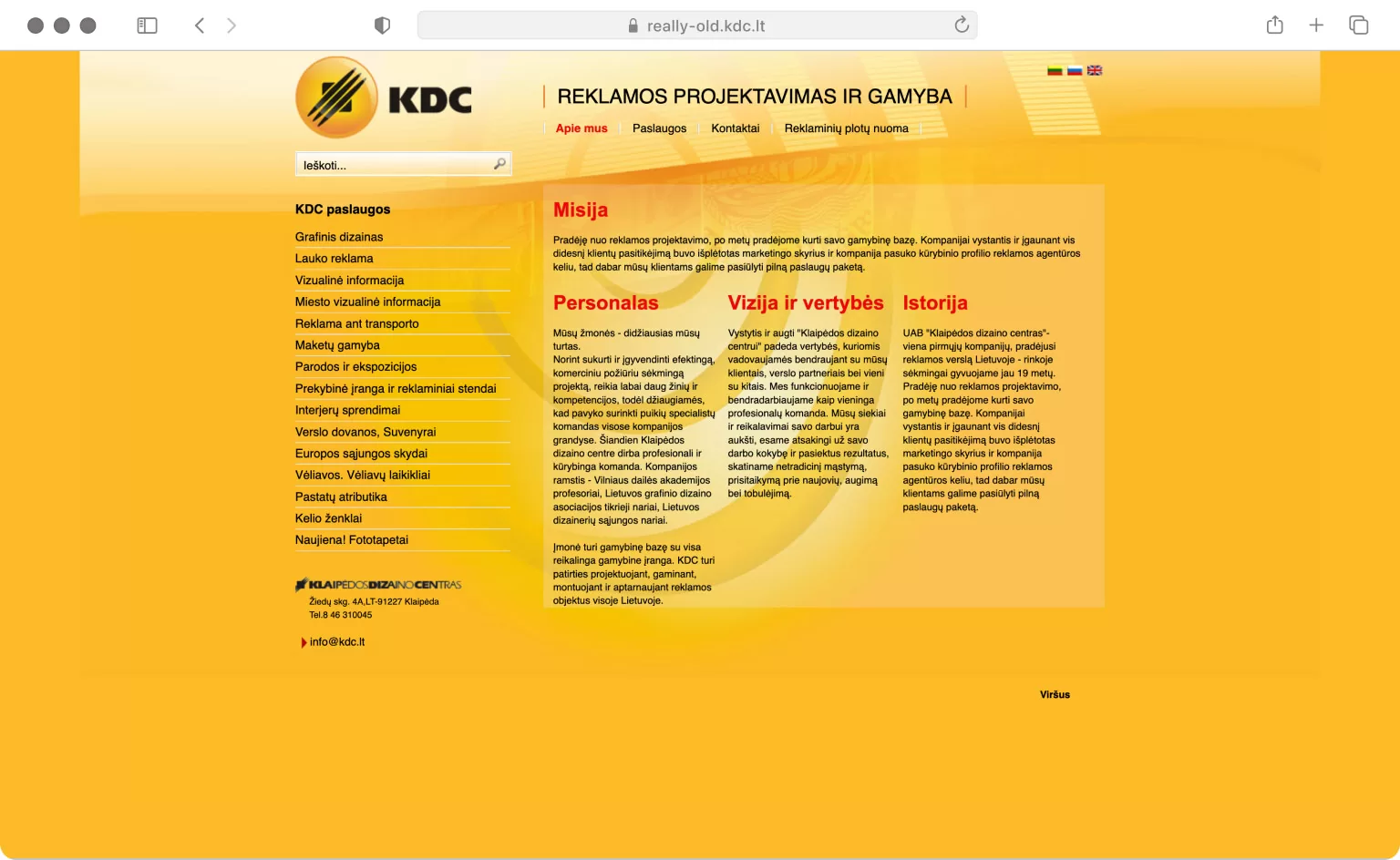
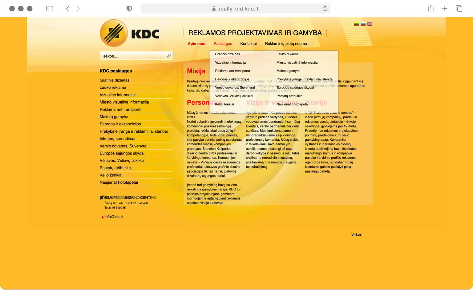
Problems
-
Problem #1
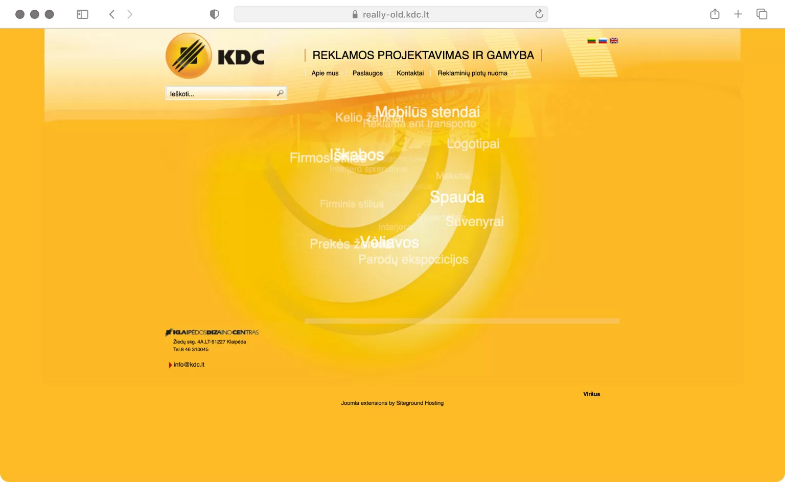
Unresponsive design, ruining usability especially for mobile users, leading to frustration and less leads.
-
Problem #2
Clunky questionable design choices such as word clouds, tags or text-heavy pages.
-
Problem #3
No clear nudges for the user while browsing the website.
Role
I was hired by the design agency to develop a working website. It was based on a visual collaborative design between a graphic designer & me. There I had a stake in consulting usability & other design factors.
Goal
Building a website from scratch to reflect design agency’s needs & provide potential clients a more efficient browsing experience: convenient, clear, yet jam-packed of new content.
Research
Good questions
My approach is to ask clients good questions that provoke deeper thoughts in a conversation. The result is saved resources such as time & money, by just enabling meaningful problem solving mindset.
I had some questions about the old website version, such as:
- What is your perspective on the need to redesign the website completely? What are your expectations for the new one?
- What is your unique selling proposition? How do you see yourself represented through a new website?
The discussions were somewhat complicated, since I was hired for this project in a hurry. Instead of stepping back completely, I tried to adjust to stakeholders’ position and still provide my point of view as a UX professional & front-end developer.
Expert review
An expert review identifies usability problems & stengths. It can also be used to determine quality of visuals & copywriting.
Since it was obvious the site desperately needed a refresh, I did not document the process of reviewing. We did quickly discuss with the client what should definitely not be considered anymore & what could be improved for the new website, based on my observations.
Summary
- Lack of responsive design
- No clear call-to-actions in any of the webpages
- Generic visual design issues, such as incohesive typography or imagery
- Questionable features such as word cloud
- Absence of guiding user to what they want to accomplish with this website
- Little emphasis on the fact it is a design agency with their own machineryI collected enough data to help establish a design direction together with stakeholders as well as think of first possible development steps.
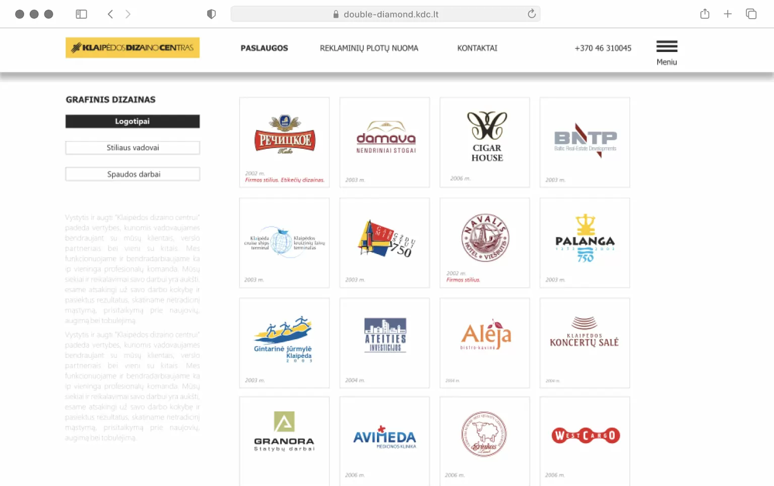
Secondary website
Klaipėda Design Center had another website, which was focused on showing off museum & exposition projects. Having a second website might be redundant, but everything depends on goals of a business.
It was shut down in the middle of development of the new website. Because of that, I could not derive much research data.
Visit expo-kdc.lt.
Process
Initial mockup
A quick wireframe was made by the graphic designer to kickstart the design process. Already better than the old website, but I provided some feedback (regarding simple aspects of UX), such as:
- Where the visitor should look at? There are too many focus points.
- Why there is a additional menu button?
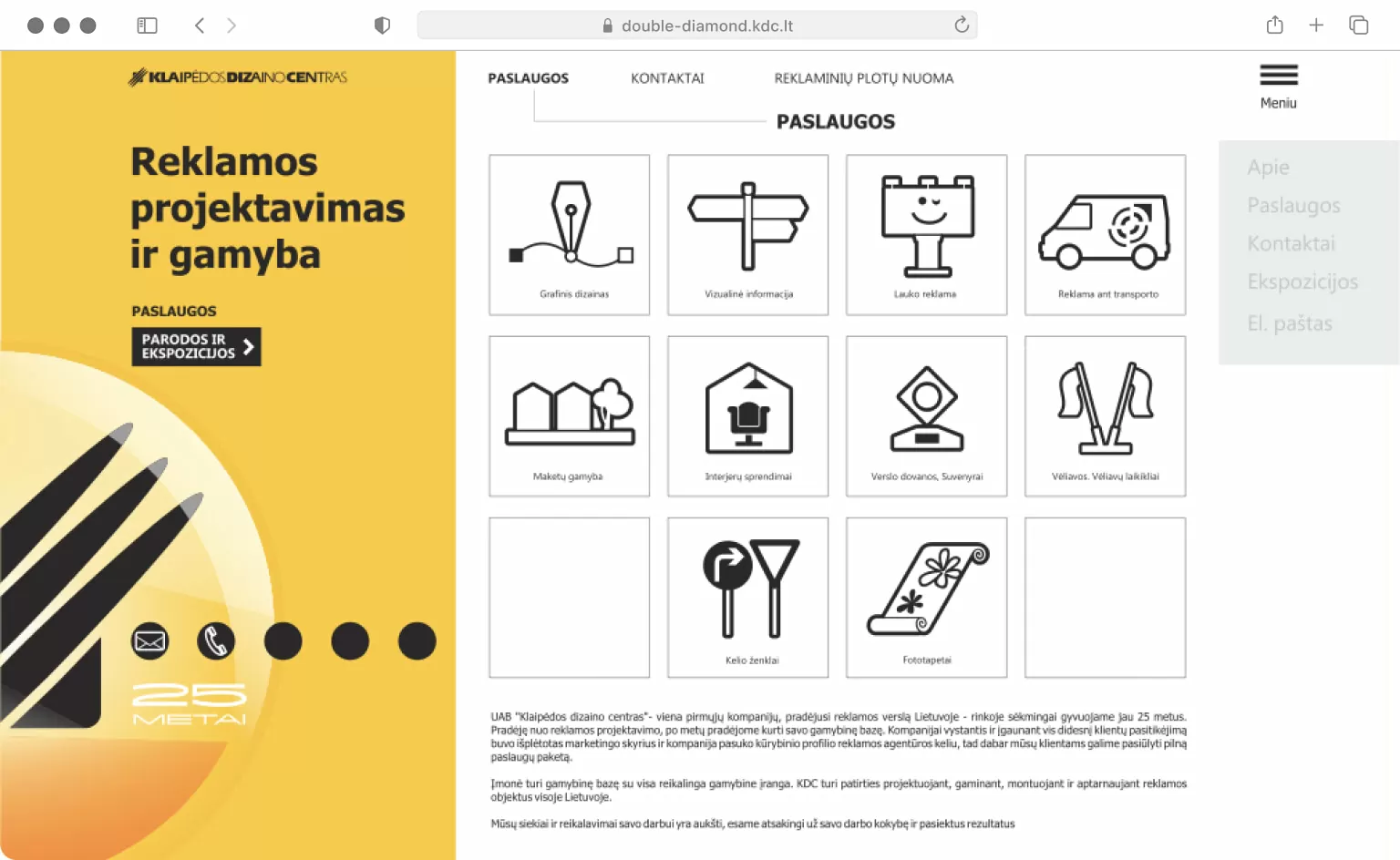
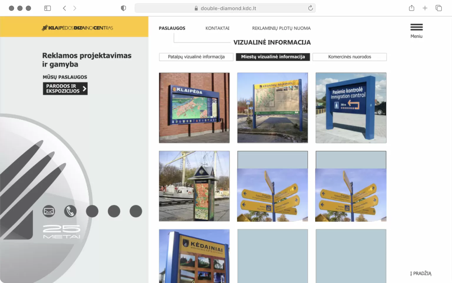
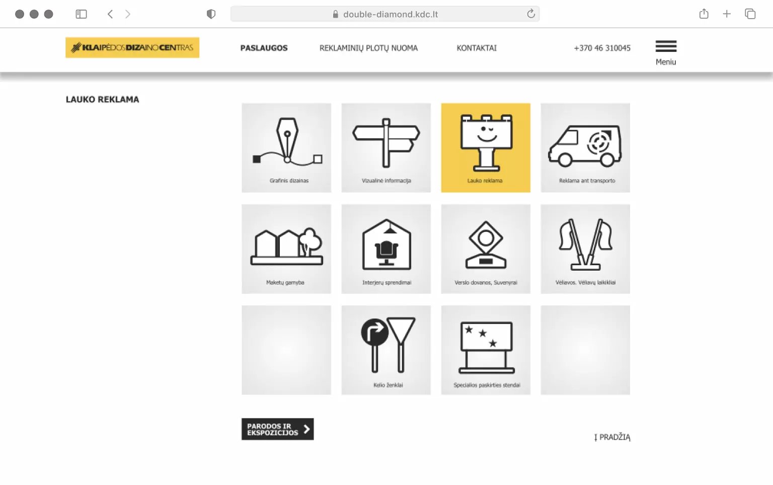
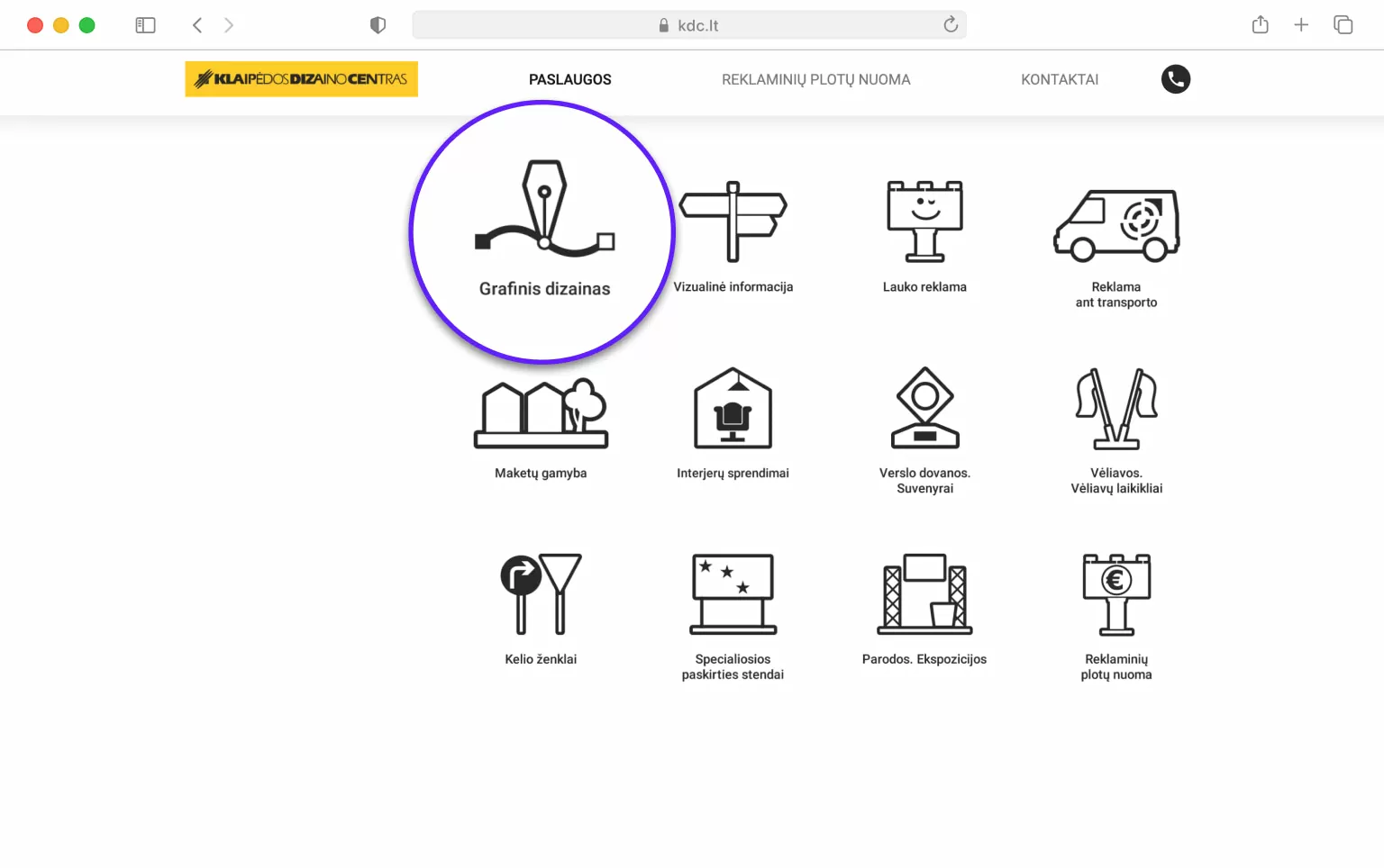
- Icons for the Services section look neat.
- Sub-category of Services page looks somewhat promising in terms of hiearchy.
Iterations
There were a couple of more versions created by the graphic designer. In fact, they are pretty close to the final design. Some feedback was considered, but I tried to understand the need why stakeholders and the graphic designer wanted to have a text-heavy homepage.
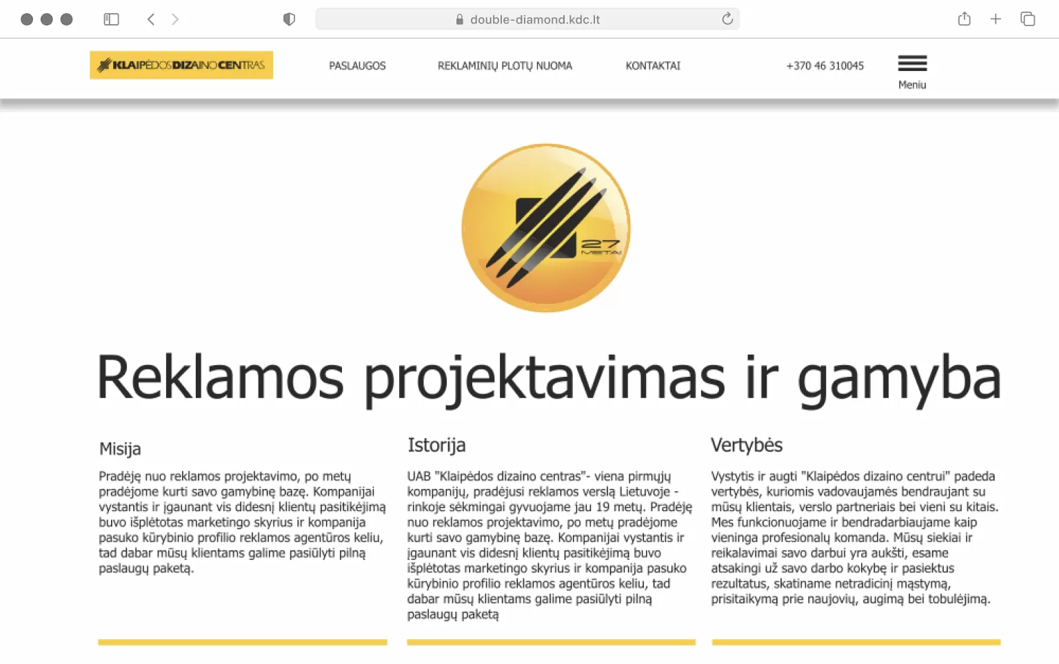
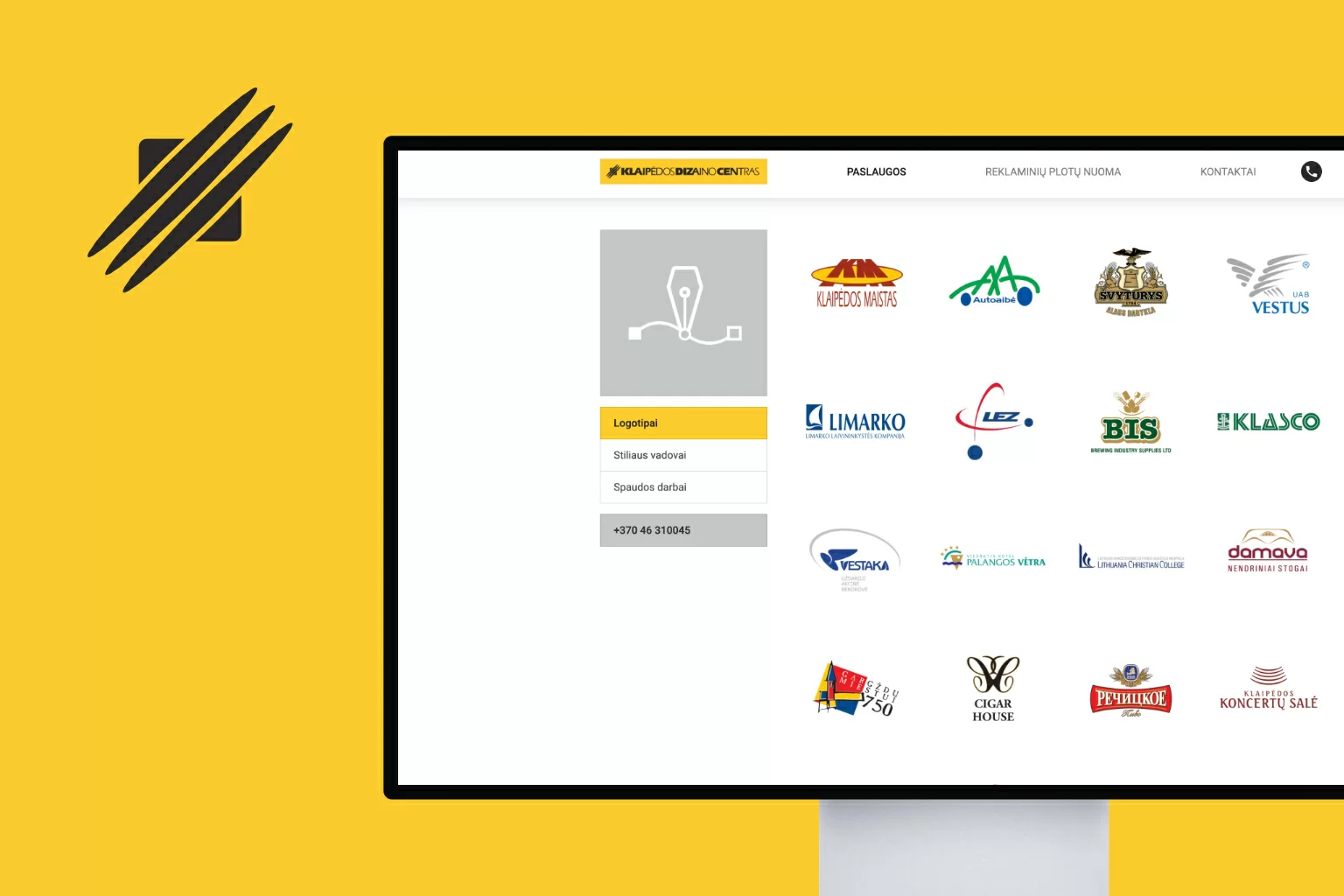
On the brighter side, the Services page and its content was clear & sleek, just as according to our goals. Details such as gradient use in graphics or amount of text would be discussed later.
The second mockup was already better, but I wanted to provide my flavor of design direction we could go in to completely minify and focus on content. Using Adobe XD I created a quick hi-fi wireframe to provoke a discussion of further content reduction that does not align with goals.
Since I did not hold main stake in visual design – only consulting – I had to be flexible in design decision making. Shortly after, my wireframe was discussed and it sparked some feedback. It has been redacted in illustrations.
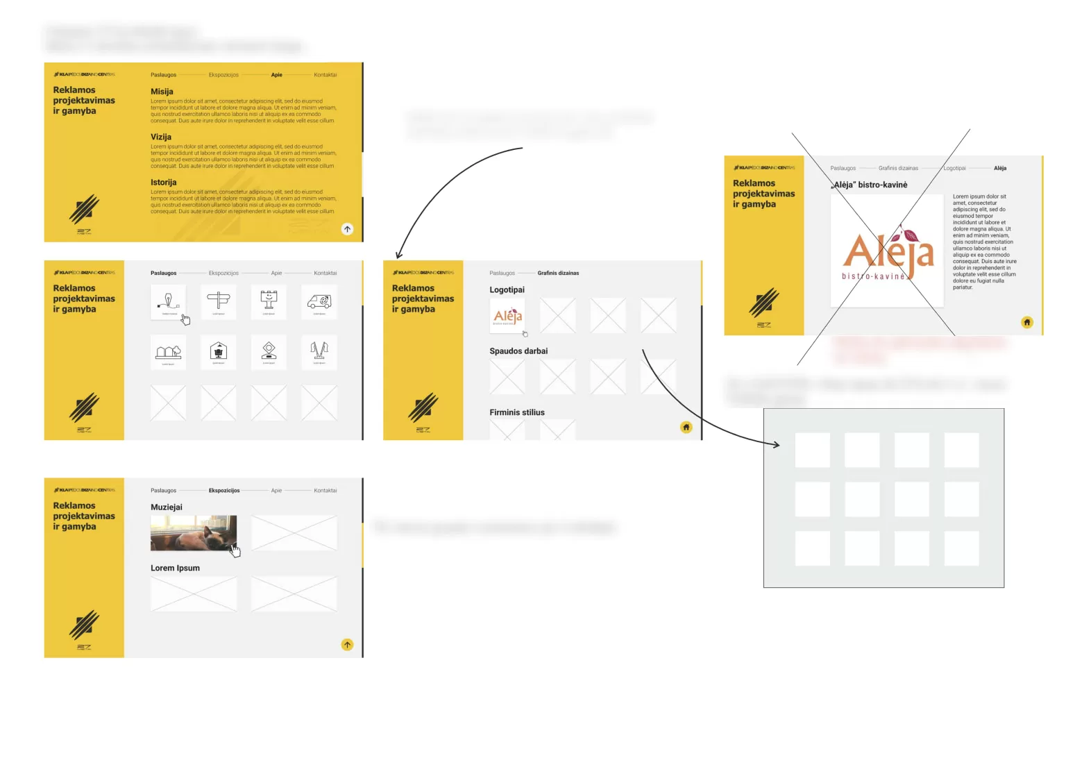
Content such as banners or pictures to be used in certain pages & sections, typography, was considered as well before creating first version of the development website.
Most of them were a collaborative process between the graphic designer & me.
Development
This is the main part of the project that I was hired for. Since this website would not be updated often, I opted-in not to use CMS, but rather Bootstrap 4, so users could enjoy a lightning quick browsing experience while I would gain more experience using the framework.
Unfortunately, there was no final & full version to be converted into a real working website, thus the process was somewhat back-and-forth and wildly iterative.
Learnings: It would definitely help to have a final (clickable) prototype of the website for development hand-off. Again, dealing regarding certain solutions or decisions between stakeholders is crucial for running project efficiently.
Result
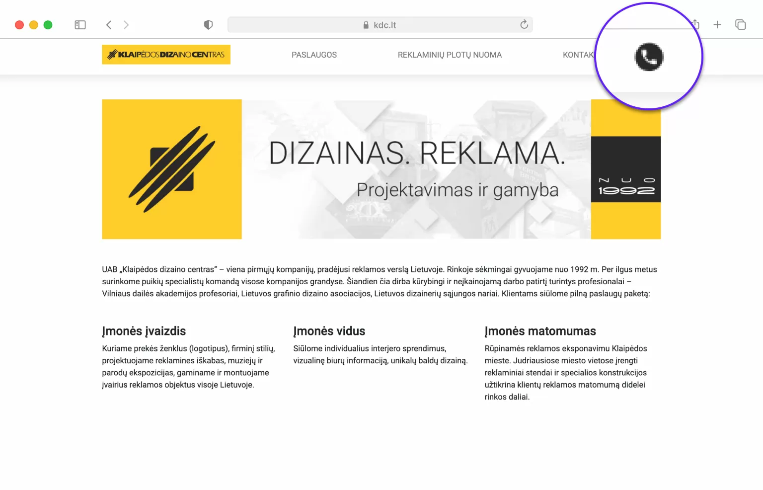
The first final version of a live website was finally created in less than a month. There were some small iterations done shortly after, as well as adding a sleek, non-intrusive GDPR-compliant cookie notice. Final launch of the website happened in early March 2019.
Testing
Testing phase for this project was minimal, though a couple of iterations were made.
The website was reviewed by employees of the agency as well as by some stakeholders’ acquitances.
The general result was positive:
- users liked the visual simplicity, yet retaining Klaipėda Design Center’s easily recognizable visual identity
- significant reduction in cognitive load compared to previous site – less text, unrelated images or other kind of content.
- minimal friction due to super fast loading times
Learnings
- A designer who takes expert position even in broader than design questions benefits the business with eye-opening solutions. Next time, I would try to negotiate certain questions differently & more in-depth.
- It is crucial to understand that stakeholders might have a completely different way of thinking, even when the client is a suitable fit to work together
- I highly prefer broader scope projects than just fully taking responsibility over development & some design consultation
- Webflow would be vastly superior for developing such a website, but there was no budget allocated for that