


Summary
Mission
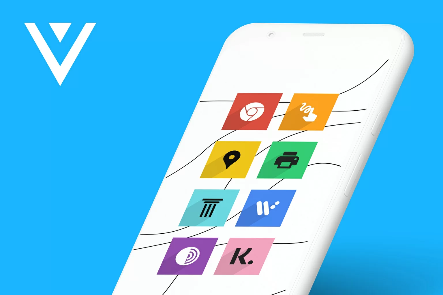
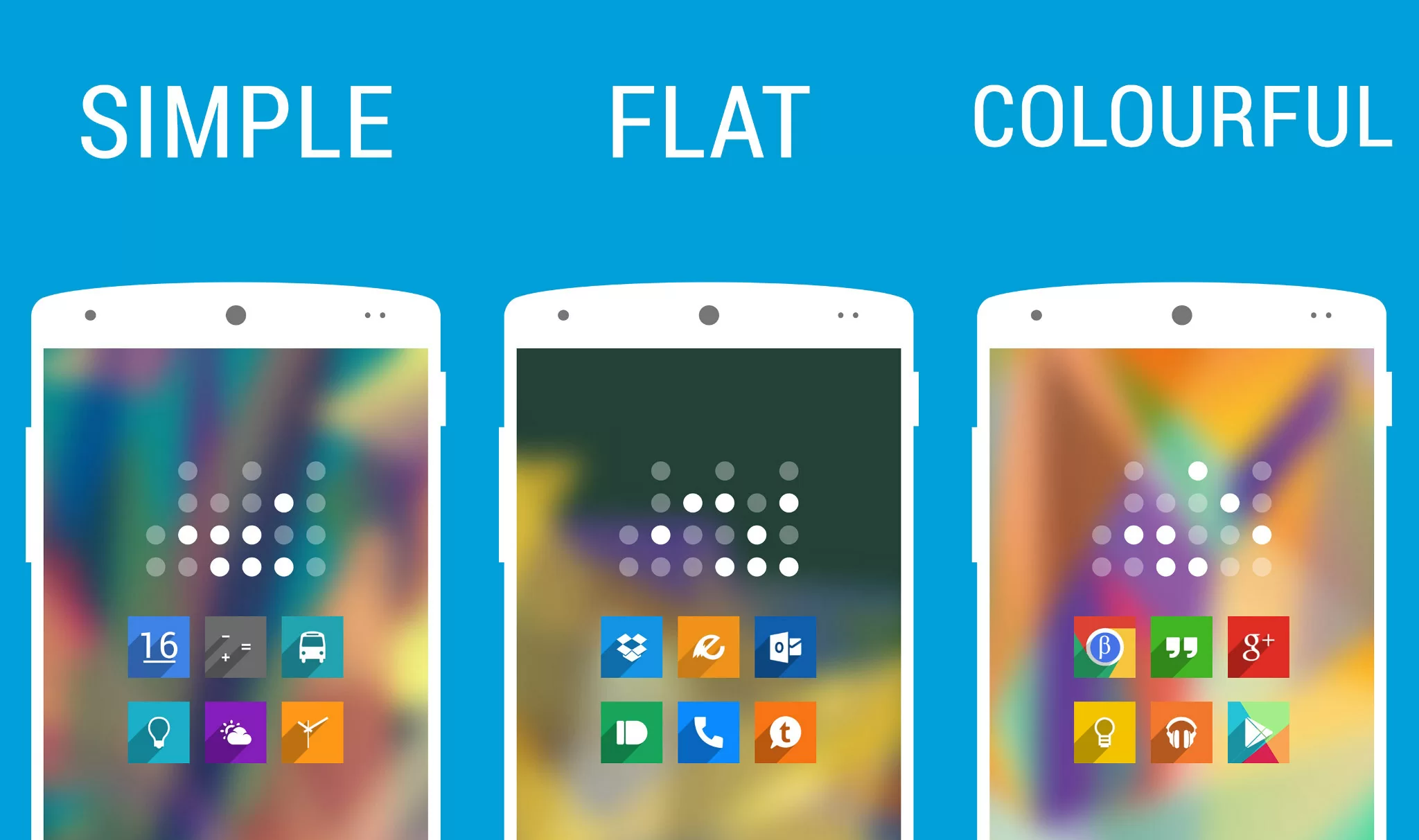
User-driven mission: Releasing & maintaining the most complete flat shadow style icon pack ever.
Self-growth mission: Immerse myself in design & software development fields. Release first app ever in my life, while working on it in iterations afterwards.
Outcome
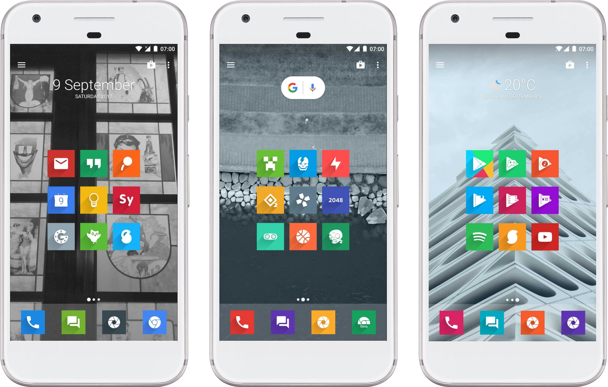
An Android app which allows users to replace default app icons with alternative ones.
A third-party launcher or other tool is necessary for Voxel to replace icons. Other functions, such as changing wallpapers or requesting icons to be themed can be done without any external apps.
Fields
- Experience design
- Iconography
- UI design
- Quantitative research
- Android development (Java & Kotlin)
- QA testing
- Customer support
- Marketing
- Project management
Impact
- Empowering & inspiring the Android customization community on Google+ & Twitter
- Ever-increasing focus on user satisfaction & quality over quantity
Adobe Illustrator
Affinity Designer
Affinity Photo
Android Studio
iOS (discontinued)
„Kūrėjų karta 2017“
Reviews
Problems
-
Problem #1
Multiple flat shadow style icon packs in the market, but none of them create a fulfilling experience – most popular icons are missing, technical issues, unsuitable wallpapers, weak support.
-
Problem #2
Developers of flat shadow style icon packs were not always active in Android customization communities on Google+ or Twitter. Such communities were emerging quickly with enthusiasm.
Role
Voxel was and still is fully maintained by me, helped by the community & users.
I oversee from big to tiny tasks: project planning, building databases from users’ icon requests, answering users’ reviews. Of course, occasional prototyping, miniscule-scale user testing and other UX-based tasks.
Goal
Immerse myself in design & software development fields
As a geeky hobbyist who was still in high school, I was seeking for ability to convert ideas to working things. Basically, dip my toes in product design & development field.
Releasing & maintaining the most complete flat shadow style icon pack ever
To offer people more than just “here is my version of a flat shadow style icon pack”. Make it as complete, as updated as possible, while engaging with and listening to the Android customization community.
NB: This project was my first major attempt at building meaningful digital experiences for people.
Research
Pre-release
Imagine you are an Android customization enthusiast. You love to change icons, wallpapers, widgets. Perhaps even tinker with more advanced system-level customization. Your daily activities might include searches for icon packs on the Google Play Store:
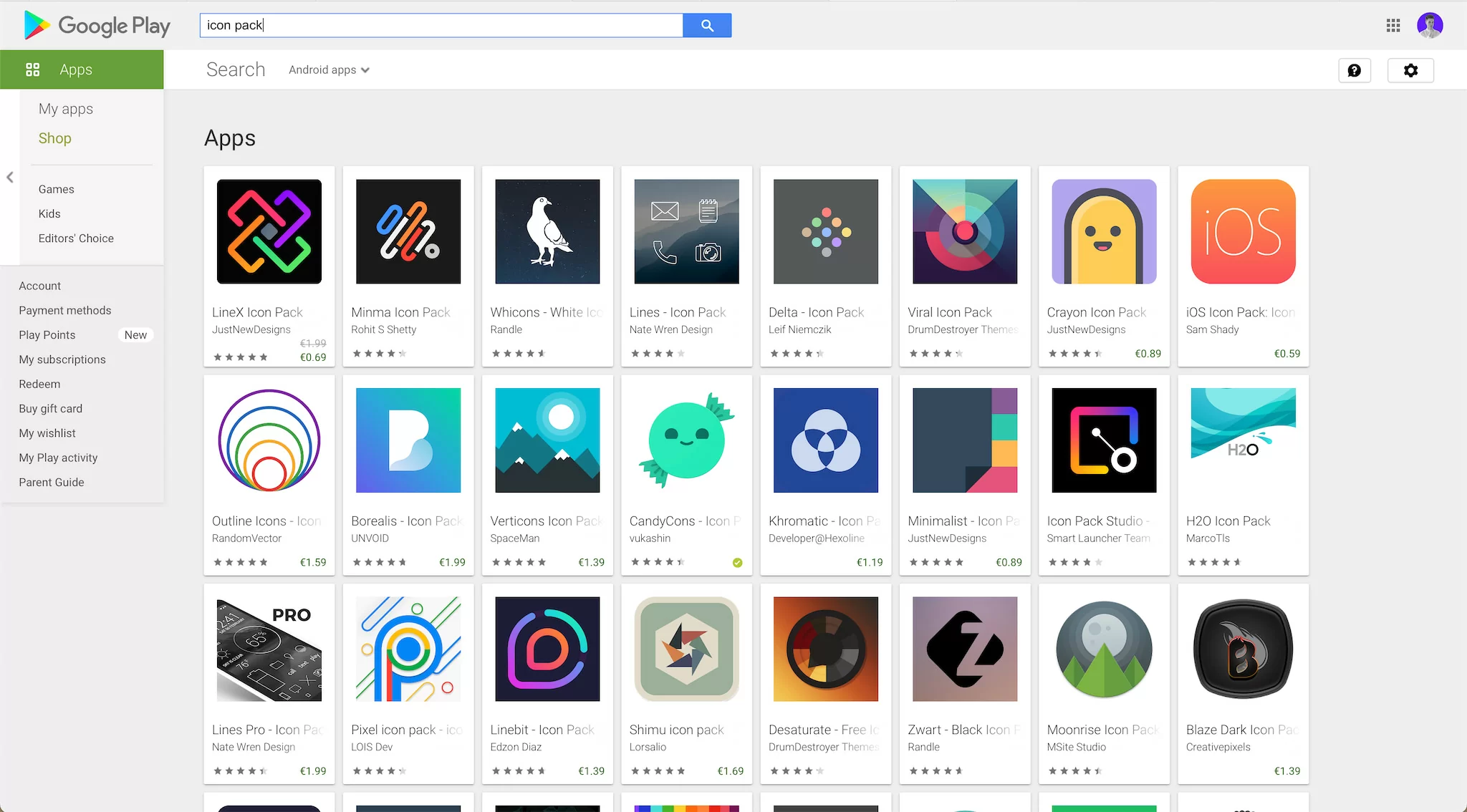
One day, you are literally frustrated with what developers have to offer. App X does not have enough icons, app Y was updated a long time ago, app Z just has lackluster consistency in style.
That is how mainly I got my inspiration to kickstart this question: what can I do & how I can create my own icon pack?
It was time to act & create. No product canvas models, no experience in project managament, no budget. Sometimes things have to be started from complete scratch.
Post-release
For each bigger feature update at least some minimal research is being done. That could be:
- analyzing user reviews on the Google Play Store
- analyzing competitors
- conducting micro-scale user testing
- A/B testing store listing or app features
- surveys
- researching new design trends
- workflow optimization
Process
Pre-release
It was late 2013 when I started to play around with creating icons in Adobe Photoshop. I did not expect quality from myself – just dedication to create quantity, which eventually would turn to quality. Applying icons on my device one by one yielded quite a pleasant visual result.
Learning: quantity over quality in the early game.
Based on tutorials from YouTube & XDA, I was able to setup my first app ever, based on the provided template. After a couple of personal touches I have already setup basic things such as: text strings, colors or layouts. All I had to do was include icons with the app and see what is the result of the first development version of Voxel.
Learnings:
- This is how I got the gut feeling of the need to brand the application. There must be visual identity system in place as well as with other branding properties.
- Play the long game – this is an iterative process, both in terms of design (icons) & development (features).
- Do not use Photoshop as a primary tool for vector designs.
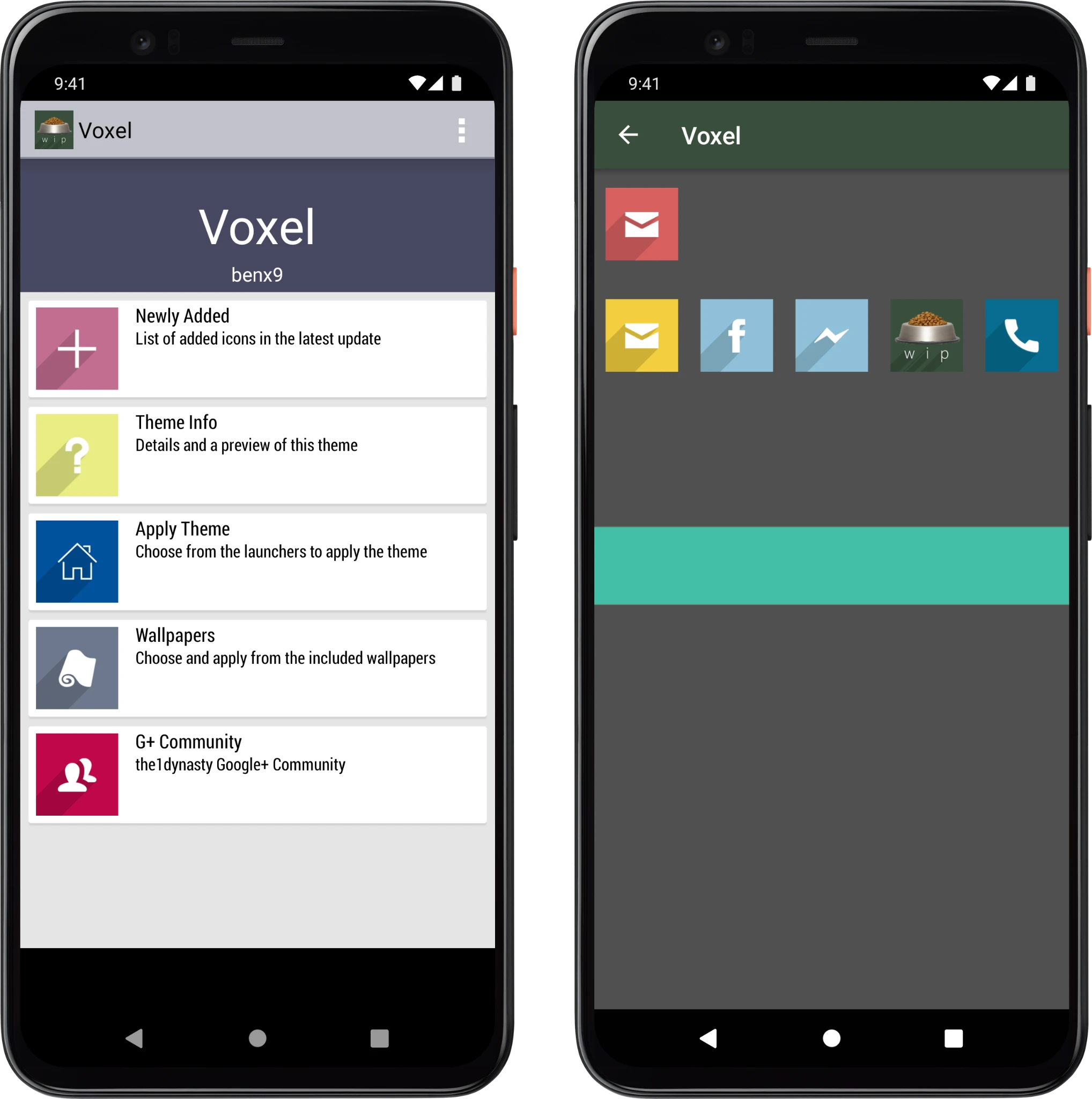
After many private development releases, I decided to take a shift and switch to a more polished app template before final release. That allowed me to:
- represent Voxel’s visual identity better
- allow users to view all icons that Voxel was offering
- improve usability, and visual language that Android was using
- introduce an icon request tool, which saved time for consumers as well as me creating new icons
Post-release
After some groundwork, it was time to orientate and do what makes the most impact first: receiving feedback and applying appropriate decisions, while trying to reply to users’ emails.
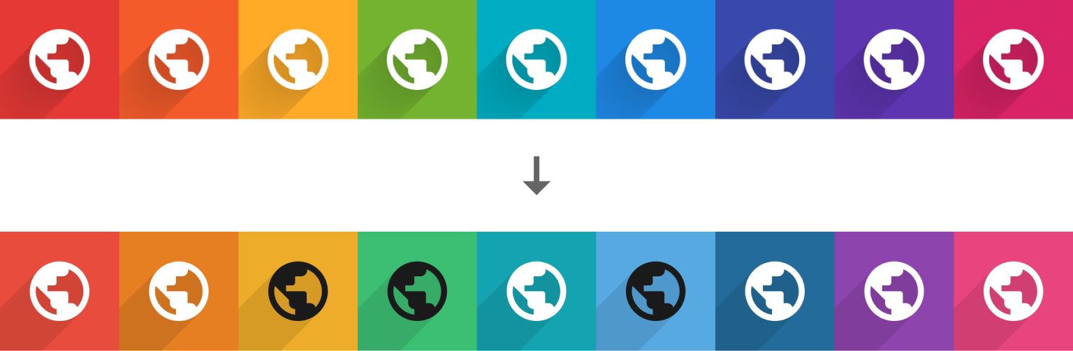
Voxel’s visual identity was evolving very quickly, thus many changes were implemented over a span of 3 months. A couple of months after Voxel’s release, the identity finally settled.
Speaking of iconography, there was a transition to another color palette. Material Design guidelines were released for the first time, together with a very cohesive color palette. From my observations, users loved it so much, I decided to create some polls which made me nudge to push another major change to Voxel:
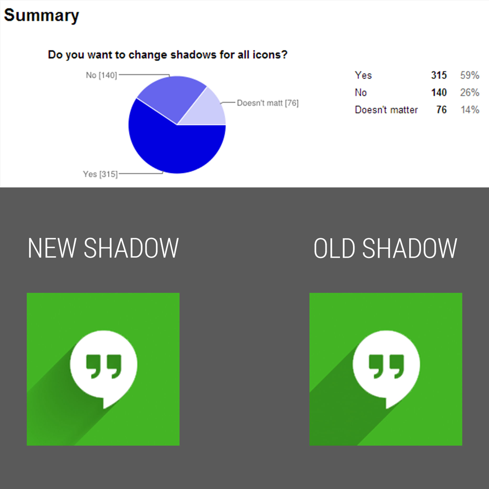
The change was worth it, since that allowed Voxel to become the quickest growing icon pack by unique user acquisitions yet in mid-2014–2015. At the same time, it also posed a challenge for me: there were so many customer emails calling for support, that I really had a challenge dealing with them. I could not offset this work to other people at that time, unfortunately.
Learnings: be prepared to explode & grow, but keep expectations low.
Present
Due to time constraints, Voxel is receiving quarterly updates, but there is tremendous focus on keeping user support & loyalty higher than ever before. Also, focus is on customer satisfaction, not user growth – which stopped a long time anyways.
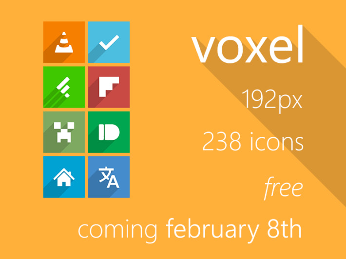
Many icons are being reworked to higher resolution, making them more cohesive thanks to the flat-style color palette (throwback!) I made specifically for Voxel. Since I have transitioned to work with Affinity Photo & Designer, that also required some technical planning how to create actions that will batch edit 5000+ of icons.
Testing
With Friends
One of my friends was into Android customization around that period.
Before Voxel was released, I was usually sending him over an in-development app version for testing purposes. Usually, the tests were simple: I had a few questions to which I wanted opinion on. He was free to express his overall opinion on using Voxel as an app and as an icon pack.
Then, the collected data was processed and results were implemented into the app. Similar methodology was used post-release of Voxel with other people I knew.
With the Community
Most of the feedback happened in a few Google+ communities back in the day. Since Google+ was shut down in 2018, there is no way of actual user feedback to be shown here.
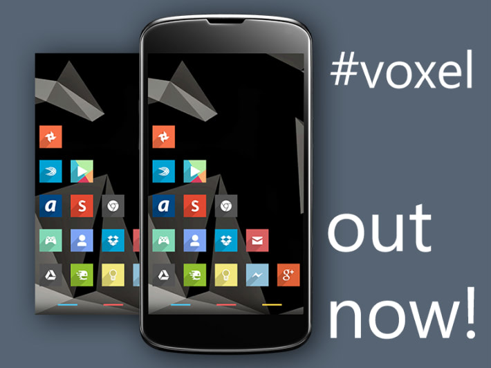
Some teaser posts were made before & for the official Voxel release in 2014:
These were the results:
- That allowed me to see what is general community’s reaction to (yet another) flat style icon pack – it was really positive:
-
- Perhaps I could add more icons
- Portion of people were willing to pay and support my work
- My Google+ profile started to gain traction
- Hands-on with how should I talk to people interested in this project
Similar posts regarding updates, beta tests, surveys were made for many years to come.
After Google+ was shut down, access to the community was lost, with “refugees” moving to platforms such as Twitter, Telegram or Discord. This posed difficulty connecting with the community.
Results
Future Steps
- Discontinuation in 2024 or open-sourcing to the community
- Potentially creating a hi-res version for Windows customizers